Behind the scenes: Crafting the Tour de France Singapore Criterium 2023 key visual
The Tour de France, renowned as the world’s toughest and greatest cycling race, has been captivating audiences since its inception in 1903. This year, the Tour de France Singapore Criterium is holding its second edition of the race, where we had the opportunity to work alongside the Tour de France team as our first client to create a key visual that aligns with their brand. In this article, we will take you through our 8-step process behind the creation of the Tour de France Singapore Criterium 2023 key visual.
1. The Brief Breakdown: Unveiling Tour de France Singapore Criterium as the Event of the Year
Contrary to what you may think, the brief itself is one of the key elements of any design. Before any designs are done, it is important to break down the brief and highlight the key points to make sure we fully respond to the client’s needs. In this instance, we needed to highlight the Singapore Criterium as the pinnacle event of the year. Our goal was to create a key visual for the 2023 Singapore Criterium and propose a new theme that amplifies the buzz of the event to create more engagement.
2. Uncovering the Unseen: The Power of Research in Design
There are many different types of research methods taken within a design, especially those that are non-visual. This is often an overlooked part of the design process. Research helps to provide different kinds of evidence to how design decisions are made, and how graphic devices are used, interpreted, and situated. In this instance, the Singapore Criterium is a unique event for a very specific audience that only takes place once a year. Some insights we got from our research were
Last year’s event, the first edition of Tour de France Singapore Criterium, had room for even greater emphasis on the exhilarating intensity of the race.
The circuit design of the race itself is very unique and was something we needed to keep in mind.
The race itself evokes a rollercoaster of emotions.
People at the race were observed to be undergoing the raw highs and lows of the race, whether they were competing at the race or a spectator watching right by the sidelines.
As visual research is also important in design briefs, we cross-referenced past sporting events (e.g. Formula 1, previous editions of Tour de France) and what their campaigns had in common.
3. Igniting Creativity through Brainstorming: From Keywords to Concepts
Once the research is completed, the next step in the design process is brainstorming! To begin, I carefully review all of the research notes and the project brief, identifying the key themes that stand out. I then utilise these keywords to create word clouds, which serve as a springboard for further brainstorming.
4. Breathing Life into Ideas: From Word Clouds to Sketches
After I have drawn out many word clouds, I then proceed to the fun part! Sketching! This is where all the ideas start flowing. During my university days, we were taught the diverge-converge method, which involves rapidly sketching as many quick ideas as possible within a set time limit. From these sketches, I pick the top 3 that best align with the project brief and further develop them. This iterative process leads us to reach some cool concepts and ideas!

Diverge-converge method which involves drawing as many quick ideas as possible within a set time limit
5. From Paper to Pixels: Bringing the Key Visuals to Life
At this stage, I developed several sketches showcasing different concepts to present to the client. I then took to the computer to create my first digital sketches. Amongst the concepts, the one chosen was “Fast and Fearless” which captures the essence of the race’s speed and stamina.
As mentioned, one of the key insights of the research was the idea behind a rollercoaster of emotions at the race. At the Tour de France, whether you’re competing at the race or one of the spectators right by the sidelines, you get to experience the raw highs and lows of the race. Hence, the first draft I came up with was aimed to emphasise the race’s momentum and pace, simulating the exhilarating experience of being on a rollercoaster and witnessing the world whizzing by.
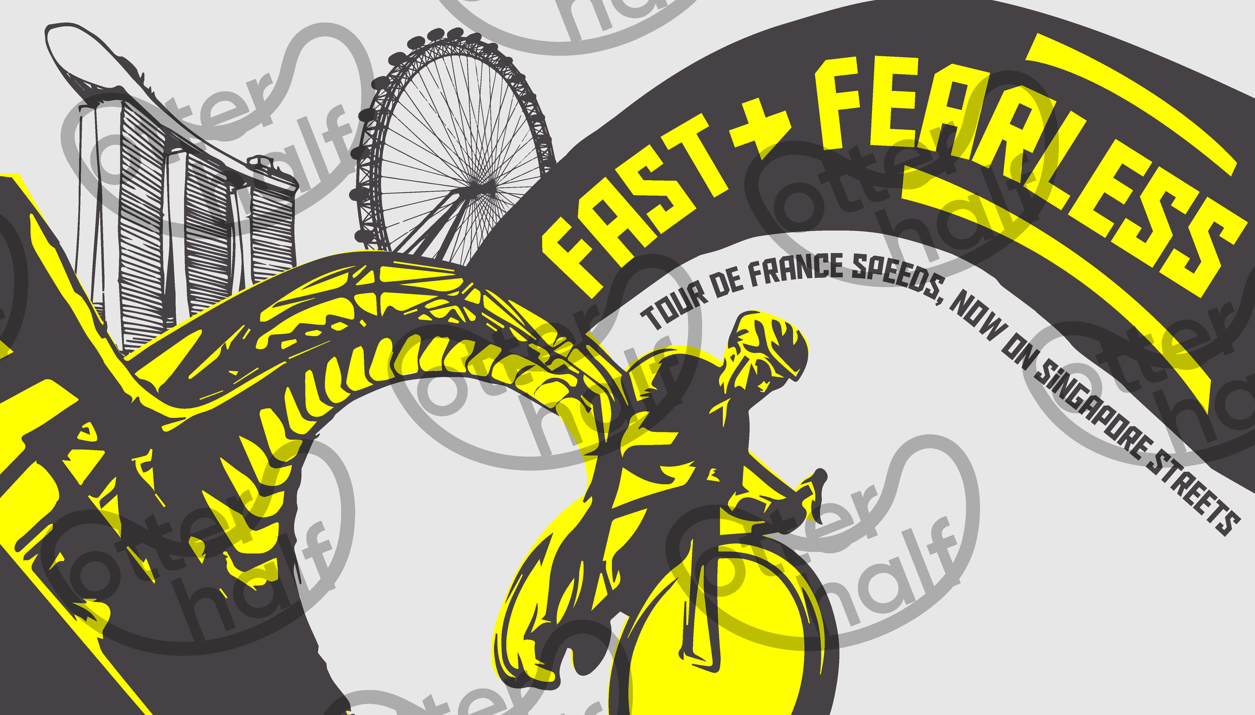
The first version of the key visual presented to the client.
6. Valuing Input: The Role of Feedback in the Design Process
An important part of any design process is feedback, and it should always be received openly and calmly. In our case, one of the feedback we received was the use of the colours. While our intention was to create a bold and eye-catching design that stood out from the crowd, the client expressed the importance of maintaining brand consistency and aligning with the original Tour de France colour palette. Hence, we took this feedback into consideration and made the adjustments accordingly.
7. The Quest for Perfection: Refining the Key Visuals
After rounds of feedback and multiple edits, we finally got an approved key visual to capture the spirit of the Tour de France Singapore Criterium race! The collaborative effort, combined with meticulous reviews and refinements, allowed us to achieve a visual representation that resonates with both the client and the target audience.
8. The Grand Reveal: Presenting the Approved Key Visual

The final approved version of the key visual.
Embarking on this creative journey for the Tour de France Singapore Criterium 2023 has been a remarkable experience. From breaking down the brief to conducting in-depth research, brainstorming ideas, sketching, receiving feedback, and refining the design, it has been a humbling yet eye-opening experience to be able to contribute to the visual narrative of one of the world’s oldest and most prestigious bike races in the world.
If you are looking for a partner to bring your creative visions to life, we might be the right OtterHalf for you.